Accessible website content will be obligatory starting 2016. The clock is ticking. Companies that offer goods, services, and information, have to do so on a high accessibility scale, namely, accessible to everyone.
Admittedly, we have paid very little thought to this issue at the beginning of our development. “It looks good, it should be fine”, we thought. Since May, however, this has changed. We have taken the issue of accessibility seriously. To accompany the development process, we asked a consultant to help us – Andreas Jeitler, who also consults the University of Klagenfurt in the accessible design of communication systems and in teaching. His first reaction in the summer was not bad. But he showed us that we still have a lot of homework to do.
Smartphones are perfect assistants.
For people with visual impairments, the smartphone as a practical everyday helper is very important. “I use my smartphone every day: in the morning while on the bus I, for example, use it to read the news to me, which is very convenient”, explains Jeitler.
So how can the content from a mobile website be read by people with visual impairment? The content is either well shown and big enough to be recognizable by visually impaired, or the user can use a screen reader. Together with Andreas Jeitler, we have been working to make content on xamoom as accessible as possible. The expert was impressed by some improvements: “The features on your CMS are really great, not many have that. You should publish how you do it”, says Andreas. And that is what we are about to do here.
What tips and tricks are there to make the mobile Web offers more accessible to people with visual impairments?
 1. Improve the contrasts.
This simple trick will especially help people with bad vision to better see the contents of a website. They need the displayed content to have high contrast. For this, there are color standards and limits. If you want to check your contents and make sure you provide good contrast, one of the plugins you can use is Contrast Checker Plugin for Firefox. It shows what content already provides sufficient contrast and where more work is still needed.
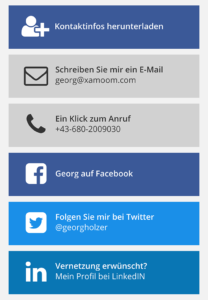
The perfect contrast is, of course, black and white. When you work with colors, however, it might get difficult. For example, the exact Twitter-blue (#4099FF) cannot be well combined with white. We had to slightly darken the CD-color of social media giants (see right) to make it more readable.
2. Make your page suitable for screen readers.
Many people with visual impairment rely on screen readers. Such programs read the texts out loud and guide the person through the website in that way.
For the content to be screen reader-compatible, some HTML elements have to be used properly and with appropriate attributes. Here are three examples:
Read the text in the correct language.
For a text to be read in the correct language, the correct language attribute needs to be provided. Because hardly any website provides that, the text mostly results in gibberish. One can imagine how it sounds when e.g. German content is pronounced in an English way.
A complete HTML page is associated with a certain language with the “lang” attribute of the HTML tag – French in this example:
<html lang="fr">
But you can also distinguish individual paragraphs in the correct language. In a paragraph tag <p>, this looks as follows:
<p lang="fr">Ceci est un paragraphe.</p>
Work with a clean structure.
Care is also needed in the structure of the pages so that individual elements are recognized properly. Screen readers can recognize a menu for example, when the NAV attribute is used.
<nav>
 <a href="/">Home</a> |
 <a href="/product/">Product</a> |
 <a href="/contact/">Contact</a>
</nav>
Use the right elements.
We use fairly large, finger-friendly blocks (see top right) to represent links on the smartphones. Previously we used HTML links that were styled to be rectangular with the help of CSS. Andreas recommended to instead present them as buttons, to be correctly identified by screen readers. Here is our example:
<button class="link-block youtube">
 <span class="title">YouTube</span>
</button>
And the link to it? That one is called with a click event via JavaScript.
Our big goal: ARIA
We have come to a certain extent already, but still far from our goal. We want to implement a number of other recommendations of Andreas and work on ongoing developments in the ARIA guidelines (Accessible Rich Internet Applications) of the World Wide Web Consortium considering and implementing as thoroughly as possible.
It will not be simple and it comes with a lot of compromises. Why do we do this to ourselves? Because in the end, it does not only help people with visual impairment but ourselves.
Thank you, Andreas, for the support and advice so far. And what he must say about our progress so far, you can see here:


 1. Improve the contrasts.